
Designer-Recommended White and Off-White Paint Colors for Oregon Homes

White paint is hard to choose because it changes with light, undertones, and the materials around it. In a remodel, the right white or off-white needs to work with cabinetry, flooring, tile, trim, countertops, lighting, and any existing finishes that will remain in the home. Which is mildly unfair, considering it is called “white,” as if that should be the end of the conversation.
Additionally, did you know that there are thousands of white and off-white paint colors to choose from? This adds to the complexity of choosing the right one for your remodel. A white or off-white that looks soft and balanced on a small swatch can feel too stark, too yellow, too gray, or too flat once it is painted across a full wall. Some whites feel crisp and clean. Others feel creamy, warm, muted, or almost beige. The differences can be subtle at first, then very obvious once the paint is covering an entire room.
For homeowners planning a remodel, this matters because paint is rarely an isolated choice. It becomes part of the larger design conversation. The color on the wall affects how wood tones read, how tile feels, how cabinetry stands out, and how connected one room feels to the next.
Let’s take a look at how designers think about white and off-white paint selections during a remodel. We’ll share favorite selections from Thayer Design Build designers, Irene Romashek and Caroline Lombardi, and include additional options recommended by leading paint companies. Before getting to specific colors, it helps to understand what designers are looking for when they compare one white or off-white against another.
What Designers Look for in a White or Off-White
Designers do not choose white paint by asking, “Which one is prettiest?” That would be too easy.
Instead, they look at what the color needs to do in the room. A white used on trim has a different job than a white used on walls. A soft off-white in a dining room may need to feel warm and grounded, while a cleaner white on a ceiling may need to quietly brighten the space without drawing attention to itself.
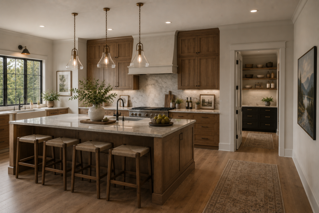
The first thing designers usually look for is undertone. Most whites are not purely white. They may lean warm, cool, creamy, gray, beige, yellow, or even slightly green depending on the formula. Those undertones become much more noticeable when the paint is placed next to wood floors, stone counters, tile, cabinet finishes, or existing trim.
Light is the next major factor. A room with strong natural light may make a white feel brighter and cooler. A shaded room may make the same color feel dull or heavy. Artificial lighting matters too. Warm bulbs can make an off-white feel creamier, while cooler bulbs can make a soft white feel sharper.
Designers also look at contrast. If the walls, trim, ceiling, and cabinetry are all close in color, the room may feel soft and seamless. If the trim is a cleaner white against a warmer wall color, the details stand out more. Neither approach is automatically better. It depends on the architecture, the materials, and how defined or quiet the room should feel.
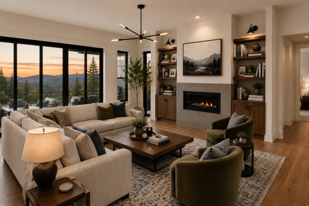
In a remodel, designers are also thinking about what stays. Existing wood flooring, original trim, fireplace stone, built-ins, or adjacent rooms can all influence the best white. This is especially common in older Mid-Willamette Valley homes, where a remodel often needs to feel fresh without ignoring the character that was already there.
So while paint may be one of the final visible choices, it is connected to almost everything else. The goal is not to find a universally perfect white. The goal is to find the white or off-white that makes the whole room feel intentional.
Thayer Designers’ Favorite White and Off-White Paint Colors
Once the lighting, materials, and room function are part of the conversation, specific paint colors become much easier to evaluate. The goal is not to find a white that wins some imaginary tournament of whites. The goal is to find a color that does its job well in the right setting.
Thayer Design Build designers Irene Romashek and Caroline Lombardi each shared white and off-white paint colors they often recommend for remodels. These are not meant to be used together as one complete palette. They are designer favorites that work well in specific situations, depending on the room, the surrounding materials, and the overall design direction.
Shell White SW 8917
Irene describes Shell White as a soft, light neutral that can work almost anywhere when the goal is a bright, warm, and welcoming background.
It can be a good fit for walls, ceilings, and trim because it has a gentle quality without feeling too stark. For homeowners who want a room to feel open and comfortable, Shell White can offer that clean backdrop while still bringing warmth to the space.
White Snow SW 9541
White Snow is another warm white Irene likes for trim, doors, ceilings, and window casings. It is especially useful when a room needs contrast against darker warm wall colors.
This can matter in a remodel because trim and ceiling colors often need to support the rest of the design without calling too much attention to themselves. White Snow can help define architectural details while still feeling soft enough to work with warmer finishes.
Sleepy Owlet SW 9513
Sleepy Owlet is a richer, creamier neutral that Irene recommends for family rooms and dining rooms. It pairs especially well with wood finishes and gives a space a warm, earthy mood.
This is the kind of color that can help a room feel settled and comfortable rather than overly bright. In spaces where people gather, eat, relax, or host, that warmth can make the room feel more connected to everyday life.
Cheviot SW 9503
Caroline recommends Cheviot as a timeless warm off-white that works well for light, cohesive interiors.
It can act as a clean backdrop for layered materials, including furniture, artwork, textiles, and natural wood tones. That makes it especially useful in remodels where the design includes a mix of materials and the paint needs to support the room rather than dominate it.
For homeowners who want a warm, modern interior without the space feeling flat or overly white, Cheviot can be a strong starting point.
Alabaster SW 7008
Caroline also recommends Alabaster for homeowners who want a white that feels warm and inviting without looking noticeably yellow or beige.
Compared with a brighter white, Alabaster creates a softer look. It can help a room feel calm and comfortable while still feeling fresh. It also balances well with pops of color and natural wood tones, which makes it a flexible choice for remodels where the paint needs to support both neutral materials and more expressive design details.
Origami White SW 7636
Caroline also likes Origami White for homeowners who want a very light neutral that feels warm without reading too creamy.
It has subtle beige and gray undertones, giving it the feel of a very light greige. That balance helps it stay soft and warm while still feeling fresh and contemporary. In a remodel, Origami White can be a good option when a bright white feels too sharp, but a creamier off-white feels too traditional or yellow.
Additional White and Off-White Paint Colors to Consider
Thayer’s designer recommendations are a strong place to start because they come from real remodeling experience in Oregon homes. It can also be helpful to compare them with white and off-white colors that leading paint companies consistently recommend.
These paint-company recommendations are not meant to replace designer guidance. They simply give homeowners more useful starting points to sample, compare, and evaluate in their own home. A color that works beautifully in one remodel may read very differently once it is placed next to your flooring, cabinetry, tile, trim, lighting, and furnishings.
Sherwin-Williams Pure White SW 7005
Pure White is one of Sherwin-Williams’ well-known white paint colors. It is often considered a cleaner, brighter white without feeling as stark as some ultra-bright whites.
For remodels, Pure White may be useful when the goal is a fresher look on trim, walls, ceilings, or cabinetry. It can also work well when the surrounding materials already bring warmth and the paint needs to keep the space feeling clean and open.
Benjamin Moore White Dove OC-17
White Dove is one of Benjamin Moore’s most recognized white paint colors. It has a soft warmth that can make interiors feel comfortable without pushing too far into cream.
This can make it a flexible choice for walls, trim, cabinetry, and millwork. In a remodel, White Dove may be useful when the goal is a classic white that feels approachable and easy to live with.
Behr Blank Canvas DC-003
Blank Canvas is one of Behr’s widely recommended whites. It has a warm, adaptable quality that can make it useful on walls, trim, cabinets, or millwork.
In a remodel, Blank Canvas may be a good option when the goal is a simple, livable white that does not compete with other design choices. It can support a range of materials, especially when the room needs to feel fresh but not overly crisp.
How to Choose the Right White for Your Remodel
The best white or off-white paint color is the one that works in your home, with your light, your materials, and the feeling you want the finished space to have.
Start by looking at the surfaces that will have the biggest visual impact. Cabinetry, flooring, countertops, tile, trim, and doors all influence how a white paint color reads. If those materials are warm, a cooler white may feel disconnected. If the room already has a lot of crisp or cool finishes, a very creamy off-white may feel out of place.
Natural light matters just as much. A room with strong southern or western light may make a warm white feel even warmer. A shaded room or north-facing space may make some whites feel cooler, flatter, or slightly gray. Artificial lighting also plays a role, especially in kitchens, bathrooms, hallways, and interior rooms where natural light is limited.
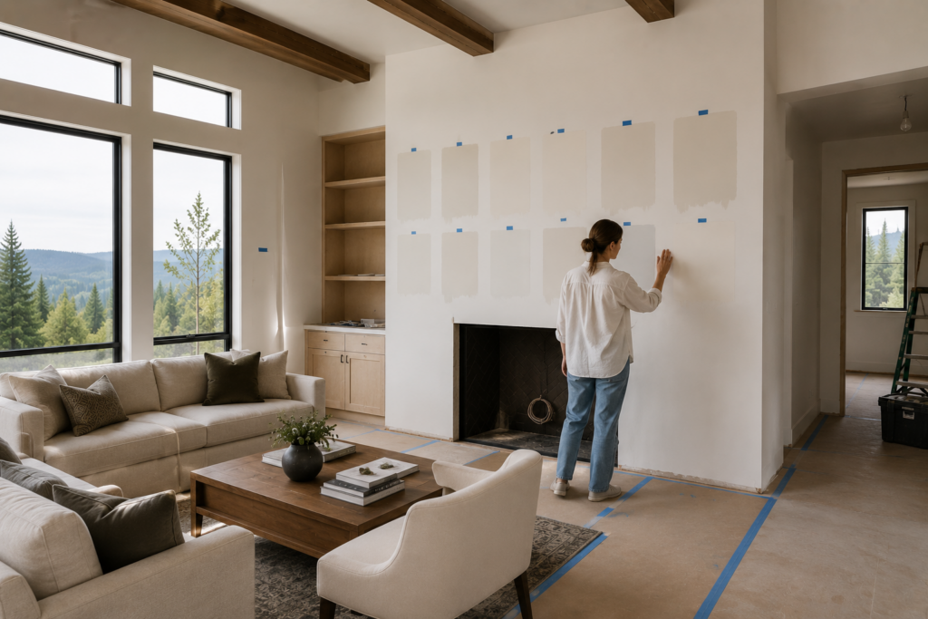
This is why large paint samples are so important. A small swatch can only tell you so much. Paint a sample on the wall or use a large removable sample, then look at it throughout the day. Morning light, afternoon light, evening light, and overhead lighting can all change the way the color appears.
It also helps to compare whites directly against the materials that will actually be in the room. Hold samples next to cabinet doors, flooring, tile, counters, hardware, and fabric selections. A white that looks balanced by itself may look too yellow next to one material or too stark next to another.
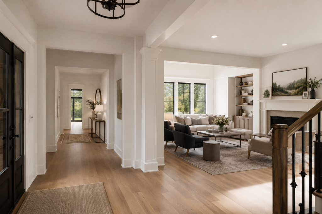
For open-concept spaces, think beyond a single room. The paint color may need to connect a kitchen, dining area, living room, hallway, or entry. In those situations, the right white should feel consistent as you move through the home, even if the light changes from one area to the next.
The goal is not to find a perfect white in the abstract. The goal is to choose a white or off-white that supports the whole remodel, from the fixed finishes to the way the space will be used every day.
Why Paint Should Be Finalized With the Full Remodel Plan
Paint is often one of the last decisions homeowners think about, but it is connected to nearly every other material in the room. The wall color affects how cabinetry looks. Trim color changes how architectural details stand out. Ceiling color can make a space feel brighter, softer, taller, or more enclosed. Even a subtle off-white can shift once it is surrounded by tile, counters, flooring, lighting, and furniture.
That is why paint is usually easier to finalize after the major design elements are selected. Cabinetry, countertops, flooring, tile, plumbing fixtures, lighting, and hardware all create the visual foundation of the room. Once those pieces are in place, a designer can evaluate which white or off-white supports the whole composition.
This is especially important in remodels because not everything starts from scratch. Many homeowners are keeping existing wood floors, original trim, stone fireplaces, built-ins, or adjacent rooms that are not part of the project. A paint color needs to work with those existing elements as well as the new ones.
In older homes throughout Corvallis, Albany, Philomath, and the Mid-Willamette Valley, these details can matter even more. Warm wood tones, shaded lots, additions from different eras, and original architectural features can all influence how a white paint color feels. A shade that looks fresh in one home may feel too cool, too bright, or too creamy in another.
A design-build approach helps because paint is considered as part of the larger plan, not as a separate decision at the end. The design team can look at the full picture, including materials, lighting, layout, and the way rooms connect, before narrowing in on the final paint selections.
The result is a color choice that feels intentional. Not because it is the most popular white, but because it belongs with the rest of the home.
Frequently Asked Questions About White and Off-White Paint Colors
What is the best white paint color for a remodel?
There is no single best white paint color for every remodel. The right choice depends on the room’s natural light, artificial lighting, cabinetry, flooring, countertops, tile, trim, and existing finishes.
A warm off-white may work beautifully in a room with wood tones and layered materials. A cleaner white may be better when the design needs a fresher, brighter backdrop. The best choice is the one that supports the full design, not just the one that looks appealing on a paint chip.
Should I use the same white on walls and trim?
You can, but it depends on the look you want. Using the same white on walls and trim, often in different sheens, can create a soft and cohesive feel. This approach works well when the goal is a quieter room where the architecture does not need strong contrast.
Using a different trim white can create more definition. This may be helpful when you want doors, window casings, baseboards, or crown molding to stand out more clearly.
Are warm whites better for older homes?
Warm whites often work well in older homes because they tend to relate better to wood floors, traditional trim, built-ins, and other existing materials. Many older homes have finishes that feel warmer than the crisp whites often seen in newer construction.
That said, warm white is not automatically the right answer. Some warm whites can look too yellow or creamy depending on the light and surrounding materials. Testing samples in the actual room is still the best way to know.
Why do white paint colors look different in every room?
White paint reflects the light and colors around it. A white wall can pick up warmth from wood flooring, coolness from gray tile, green tones from landscaping outside the window, or yellow tones from artificial lighting.
That is why a white that looks balanced in one room can look completely different in another. Even within the same home, a paint color may shift from room to room depending on window direction, ceiling height, and nearby finishes.
Should paint be chosen before or after remodel materials?
Paint is usually best finalized after the main remodel materials are selected. Cabinetry, counters, flooring, tile, lighting, and hardware all influence how a white or off-white will appear.
You can start discussing paint direction early, especially if you know you want a warm, soft, or crisp interior. But the final selection should happen once the key materials are known and samples can be compared together.
Choosing a White That Belongs in the Whole Home
White and off-white paint colors are powerful because they influence how every other material in a remodel feels. They can make wood tones feel warmer, tile feel softer, cabinetry feel cleaner, or an open floor plan feel more connected.
The right choice is not always the brightest white or the most popular off-white. It is the color that works with the home’s light, existing character, new materials, and the way the space will be used every day.
Designer favorites and paint-company recommendations can be helpful starting points, but they should always be tested in the actual room. A thoughtful sample process can prevent a color from feeling too stark, too creamy, too gray, or simply disconnected from the rest of the remodel.
Choosing paint colors is easier when they are part of a larger design conversation. If you are planning a kitchen, bathroom, addition, or whole-home remodel, Thayer Design Build can help you evaluate colors alongside the materials, lighting, and details that shape the finished space.